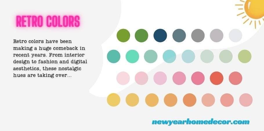
Retro colors have been making a huge comeback in recent years. From interior design to fashion and digital aesthetics, these nostalgic hues are taking over modern trends. But what exactly are retro colors? Why do they evoke such a strong sense of nostalgia? And how can you use them to breathe new life into your designs or home decor?
In this article, we’ll explore the evolution of retro colors, their impact on design, and how they continue to shape the way we perceive color today. Whether you’re looking to add a retro vibe to your wardrobe or reimagine your living space, understanding the influence of retro color palettes can help you make bolder, more creative choices.
What Are Retro Colors?
Retro colors refer to the hues that were popular in the past, especially in the mid-20th century. These colors are often associated with nostalgia, representing the aesthetic of previous decades. They evoke a sense of vintage charm and timelessness, making them a popular choice for designers and creators looking to evoke a particular mood or era.
Often, retro colors aren’t just about the hues themselves—they are about the memories and cultural movements tied to them. Whether it’s the soft pastel tones of the 1950s or the bold neon of the 1980s, these colors capture the essence of a time when design was full of personality and flair.
The History Behind Retro Color Palettes
Understanding the history of retro colors is essential to appreciate their significance. The color palettes of each era were shaped by major cultural, social, and economic events. Here’s a look at how color trends evolved over the decades:
The 1950s: Pastel Perfection
In the 1950s, pastel colors like mint green, soft pink, powder blue, and lavender dominated the design world. This was a time of optimism following World War II, and the color schemes of the time reflected the newfound sense of peace and prosperity. These light and airy tones were widely used in home decor, fashion, and advertising, creating a clean and cheerful aesthetic.
Examples from this era include the iconic pastel-colored kitchen appliances, retro diner designs, and the signature “baby boomer” style. The soft hues of the 1950s evoke a sense of innocence and simplicity, which is why they continue to be used in modern-day retro designs.
The 1960s: Bold and Psychedelic
The 1960s were all about breaking away from tradition, and this rebellion was reflected in the color choices of the era. The psychedelic movement, fueled by counterculture, brought vivid, eye-popping colors to the forefront. Neon greens, hot pinks, and bold oranges were used to express the carefree and experimental attitude of the time.
The “flower power” aesthetic dominated this decade, often blending contrasting colors for maximum visual impact. The 60s’ boldness still influences contemporary design, particularly in graphic design, music posters, and even digital art.
The 1970s: Earthy Tones and Retro Vibes
The 1970s marked a shift toward earthier tones, with colors like mustard yellow, burnt orange, avocado green, and deep browns coming into the spotlight. This palette reflected the growing environmental movement and a return to nature. These colors were commonly seen in furniture, textiles, and home interiors, where earthy tones created a cozy, grounded atmosphere.
The warm, organic hues of the 1970s continue to make a comeback in modern designs, especially in minimalist and bohemian-style decor. They evoke a sense of comfort and authenticity, making them ideal for contemporary interiors that embrace natural materials and vintage-inspired aesthetics.
The 1980s: Neon, Bright, and Electric
When you think of the 1980s, bright neon colors probably come to mind. This era was all about excess, and color choices were no different. Neon pinks, greens, yellows, and purples were paired with bold blacks and whites to create high-energy, electrifying visuals. The rise of pop culture, music videos, and video games further amplified the use of vivid colors in media and fashion.
The 1980s also saw the rise of geometric patterns, reflecting the energetic spirit of the time. Today, neon-inspired colors continue to be used in digital design, particularly in social media branding, gaming, and event promotions.
The 1990s: Grunge Meets Minimalism
The 1990s introduced a mix of grunge and minimalism, both of which had their own unique color palettes. Grunge fashion embraced dark, muted colors like deep reds, blacks, and purples, while minimalism opted for more neutral shades, such as beige, gray, and white. This duality reflected the conflicting attitudes of the time, with grunge rebelling against the excess of the 1980s and minimalism emphasizing simplicity and functionality.
While grunge-inspired colors still appear in modern streetwear and alternative fashion, the minimalist palette remains influential in contemporary design, particularly in Scandinavian interior design and modern branding.
Why Retro Colors Are Making a Comeback
Retro colors are making a major comeback for a number of reasons. First and foremost, they evoke a sense of nostalgia, transporting us back to simpler times or iconic cultural moments. This connection to the past is powerful, especially as people look for ways to express individuality and create a sense of familiarity in today’s fast-paced, digital world.
In addition, retro colors offer a unique way to infuse personality into modern design. Whether through bold, saturated hues or more subdued, pastel tones, these colors allow designers to create visually striking compositions that stand out. They also add warmth, authenticity, and character to spaces and products.
Popular Retro Colors in Modern Design
Some retro colors have remained staples in contemporary design. Here are a few that continue to be on-trend:
- Pastel Pinks & Blues: These colors are often used in interior decor and branding to evoke a sense of calm and nostalgia.
- Neon Greens & Pinks: Popular in digital design and pop culture-inspired fashion, neon colors remain energetic and attention-grabbing.
- Mustard Yellow & Olive Green: These earthy tones from the 1970s have seen a resurgence, particularly in mid-century modern furniture and organic-inspired decor.
- Lavender & Lilac: These calming purple shades are being used in both interior design and fashion, offering a touch of vintage charm.
The Role of Retro Colors in Digital Design
Retro colors have also made their mark in digital design. In recent years, we’ve seen an increasing number of websites, apps, and social media platforms embrace vintage color palettes. Designers often turn to retro colors for their ability to evoke nostalgia and stand out from the clean, minimalist designs that dominate the web.
The use of neon colors, bold typography, and geometric shapes influenced by the 1980s is particularly popular in online campaigns and creative digital marketing. Retro design elements are also commonly found in video games, e-commerce websites, and online communities.
Retro Colors in Fashion
Fashion is another industry that frequently taps into retro color palettes. Designers regularly draw inspiration from the bold hues of past decades, incorporating them into modern collections. Whether it’s a neon pink jacket or a mustard yellow dress, retro colors give a fresh yet familiar feel to contemporary fashion.
Vintage inspired clothing, such as tie-dye shirts from the 1970s or pastel-colored suits from the 1980s, continues to be popular among fashion-forward individuals. Retro colors in fashion provide a way to play with trends while celebrating the aesthetics of the past.
How to Use Retro Colors in Your Own Space
Incorporating retro colors into your home can be both fun and rewarding. Here are a few tips for blending retro tones into your space:
- Start Small: If you’re new to retro design, start by introducing small pops of color through accessories like cushions, curtains, or artwork.
- Pair with Modern Pieces: Mix retro hues with more contemporary furniture and decor to create a balanced, eclectic look.
- Use Color Blocking: Experiment with color blocking by pairing contrasting retro colors to create bold, dynamic rooms.
- Layer with Textures: Incorporate retro textures like shag rugs, velvet cushions, and chrome finishes to further enhance the vintage vibe.
Retro Colors for Your Home Office
In a home office, retro colors can help boost creativity and productivity. Try incorporating pastel tones for a calm and inviting atmosphere or neon accents to keep the energy high. Retro colors can also create a unique, personalized work environment that inspires new ideas and fosters creativity. One of the best things about retro colors is their boldness and ability to energize a space. If you’re someone who needs to stay motivated and focused, bright, vivid hues like neon green, electric blue, or hot pink can add that burst of energy you might need to fuel your workday. These colors stimulate creativity and make your home office feel lively.
The Future of Retro Colors
As design trends continue to evolve, retro colors will undoubtedly remain a key source of inspiration. With the rise of vintage-inspired aesthetics and a growing appreciation for nostalgia, it’s likely that retro color schemes will continue to influence future trends in design and fashion.
In the years to come, expect to see even more innovative ways to incorporate these colors into everything from digital interfaces to sustainable, nature-inspired interiors. The future of retro colors looks bright—and colorful!
FAQs About retro colors
What is the meaning behind retro colors?
Retro colors represent the aesthetic of past decades and evoke feelings of nostalgia, recalling the visual styles and cultural movements of the time.
How do retro colors influence modern design?
Retro colors help to create unique, nostalgic designs that stand out. They offer an alternative to minimalist or modern color schemes, allowing for more personality and visual interest.
What colors are considered retro?
Colors that were popular in past decades, such as pastel pinks and blues, neon greens and pinks, mustard yellows, olive greens, and burnt oranges, are often considered retro.
Can I use retro colors in a contemporary home?
Absolutely! Retro colors can add personality and warmth to modern interiors. Mix them with contemporary pieces for a unique, eclectic look.
How do retro colors evoke nostalgia?
Retro colors evoke nostalgia by reminding us of past cultural moments and personal memories. They often bring a sense of comfort and familiarity, transporting us back to a different time.
Conclusion
Retro colors have endured over the years due to their nostalgic charm, versatility, and boldness. From pastel pinks to neon greens, these colors have shaped not only design but also the cultural and social movements of their time. Whether you’re redesigning your living space, refreshing your wardrobe, or experimenting with digital design, incorporating retro colors can bring a unique energy and timeless appeal to your work.
Retro colors are more than just a trend they are a reflection of the past and an expression of creativity that continues to influence the future.